I thought this would be one of the simpler checks. It really was not.
Contrast keeps showing up in A11Y Cat’s history because it is one of the clearest examples of the gap between a useful quick check and an honest product claim.
In the earlier phases, contrast is already there, but by April the repo starts treating it as a problem with different confidence levels, not one clean output class. There are commits about ambiguity handling, confidence classification, evidence surfaces, non-text contrast, shadow-scope analysis, focus indicators, and cross-path proof. That is a lot of engineering attention for a feature that people often reduce to “just compare two colors.”
The later README explains why. Some contrast situations are straightforward. Some are not. If the text is on a simple, resolved painted background, you can be more confident. If the page uses layered effects, gradients, images, filters, overlays, inaccessible frames, or awkward shadow-root situations, the tool should not pretend it has the same certainty.
That honesty turns into implementation. There are explicit thresholds. There are confidence labels. There are deterministic findings, corroborated findings, and review-oriented outcomes for more ambiguous cases. And the tests keep tightening because it is very easy for a tool to overstate contrast certainty if it treats the rendered page like a flat color pair.
I think this is one of the places where the project’s philosophy becomes most visible. It would have been easier to keep emitting confident failures in more cases. That would look strong in a demo. Instead, the repo puts work into explaining why some outputs should be downgraded.
That is not just technical caution. It is a product decision about trust. If the tool keeps calling ambiguous cases hard failures, people either waste time chasing noise or stop believing the rest of the results. Neither is good.
The enterprise-readiness doc is useful here too because it does not overpraise the contrast engine. It says the contrast trustworthiness is acceptable, not solved, and still needs a broader hostile visual proof corpus before stronger claims. That is exactly the kind of sentence I wish more tooling projects were willing to write.
Visual evidence
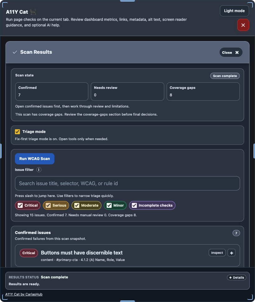
There is no dedicated historical screenshot in the repo that cleanly isolates the contrast-classification UI from this phase. The closest visible evidence is the general scan-results surface where contrast findings would live:
What I was really learning here
I was learning that some of the most familiar accessibility checks are only “easy” if I am willing to be sloppy about evidence. Contrast pushed me toward a more explicit confidence model because pretending certainty would have been easier but less honest.
Evidence
- Commits:
80a2098– contrast ambiguity handling tightened4c92ab3– confidence classification and evidence surfaces hardened6003008– ratio, focus indicator, and shadow targets expanded2cdee17– non-text and shadow-scope contrast analysis hardened1b61c47– review blockers for contrast classification fixed
- Files:
../../src/runtime/modules/contrast-analysis.js../../tests/playwright/ui-chrome-contrast.spec.js../../tests/playwright/real-axe.spec.js../../README.md../../docs/ENTERPRISE_READINESS_GAP.md