What units to use and why?
Bests practices recommend the use of responsive units such as EM, REM and percentage.

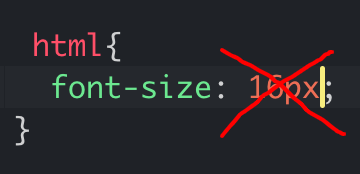
The use of responsive units in web development allows the page elements to scale proportionally to the user’s own preference settings in their browser or operating system. The default font size in almost all browsers is 16px;
What’s the importance of using responsive units?
- It is adaptable to any screen size and resolution.
- It creates more responsive websites.
- Allows users with visual impairments to control the size of the content better.
- Pages will reflect the font-size preferences of the user, the same is not possible when using an absolute unit such as PIXEL.
Some might argue that the user can always zoom the page, however, full-page zoom scales the entire page and can cause usability issues, where adjusting the font size will resize the text only.
What unit to use?
Depending on the task, the use of REM is advisable over EM.
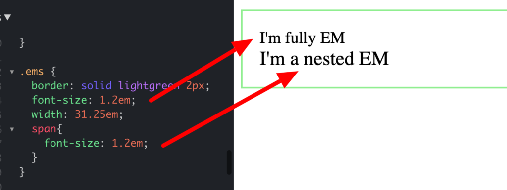
REM (ROOT-EM) is defined by the font size of the root element whereas EM is based on the font size of the current parent and the multiplication of its value, which can create scaling issues due to nesting or compound effect and cannot be determined reliably.
REM on the other hand, it’s easier to determine and use in the entire project without issues and is easier to change long-term.
Using a percentage or a responsive unit to set the font size of the HTML element will mean that the font size will always be 100% of the font size specified by the user. If the font size is set in PX the user won’t be able to adjust the font size.
How to convert from PX to REM?
Ex: 32px / 16 = 2rem calc(1rem * 32 / 16)
The 62.5% trick makes it easier as such if you set the HTML font size to 100% the default size is 16px then you must divide your pixels value by 16 to get the rem value but if you set the font-size root to 62.5% the default will be 10px and therefore 16 pixels will be 1.6rem and 20px 2rem and so on. This makes the whole calculation process easier unless you are sharing your project with other developers that aren’t aware of it.
Conclusion:
Use responsive units to overcome a series of small but bigger UX / UI obstacles that can be easily avoided. Think about user accessibility and preferences and how responsive and scalable the content is.
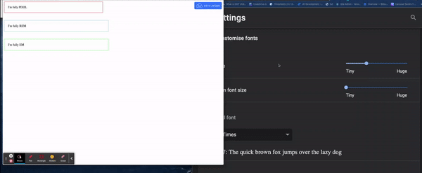
Demo:
https://jsfiddle.net/carlashub/kyseazp4/141/show
Sources: